During my time in London the British Museum was one of my favorite haunts. I visited at least five times and during my last visit I did some sketching in the galleries devoted to Greek art. The museum has one of the world’s great collections and the galleries also have seating where I could be out of the way to sketch.
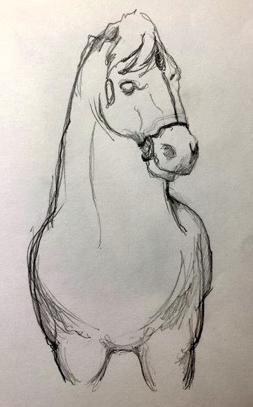
I sketched this massive horse from the Mausoleum of Halicarnassus
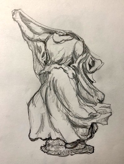
and this Nereid from the Nereid Monument at Xanthos. During this rainy, cold weather we’ve been having, I wish I was there again pencil in hand.
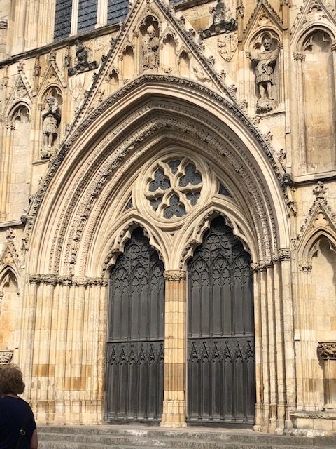
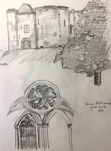
During my time in Great Britain I visited York. I fell in love with the city. It is easy to walk, has loads of wonderful restaurants and a diverse group of fascinating museums. I knew I was in “Linda country” when the first restaurant I found was the Chocolate Cafe (best hot chocolate I’ve ever had!) York also had wonderful theater and I saw a whimsical, musical version of the Secret Garden. I was also lucky enough to find that York was the summer home of the “pop-up” Shakespeare Festival. I saw an incredible version of Mid-Summer Night’s Dream. In fact there was so much to do and see in York that I had very little time for sketching. I did take one blowy afternoon to do a couple of quick sketches.
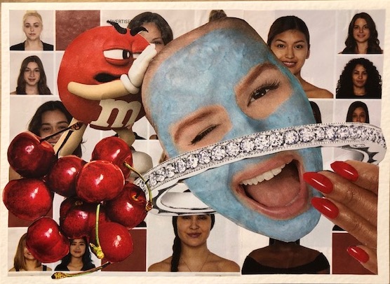
Spring is busting out all over Indiana and I have been driven to think about women “in bloom”. I was inspired by a makeup ad in “O” magazine. The background in these notecards came from the ad. It shows women in “bloom”…women of all races, ages and types. I wanted to use these really remarkable pages to create cards dedicated to strong women. When creating my first card, I focused on FUN. I wanted the card to have a light-hearted spirit and to make you laugh. Strong women can laugh at themselves after all, in fact, nothing shows strength more. I hope it gives you a giggle.
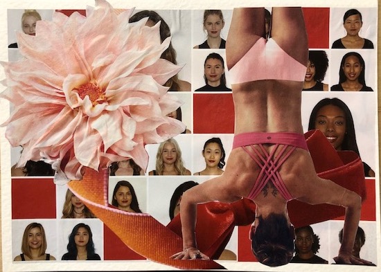
With my second card I wanted to add a soft touch but combined with strength. Kind of the yin and yang of the modern woman. I think the images work well together and I love the soft, gentle colors.
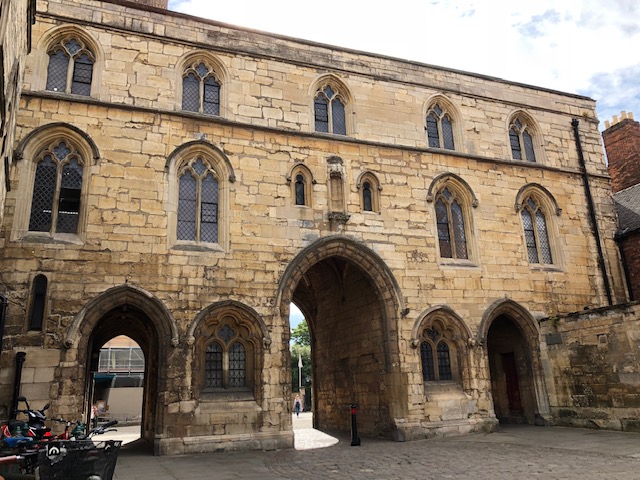
This week I have spent most of my time creating collaged notecards and bookmarks but I have been planning out some time for drawing or sketching – something I also enjoy. I want to share another location that I sketched this summer while in Europe. I only spent two nights in Lincoln but I was overwhelmed by the majesty of the massive Cathedral and the size and power of the castle. These two sit next to each other with a small square between. On each site a protecting gatehouse guards the important sites. I started a sketch of the gate that guardsthe cathedral. Here is the original.
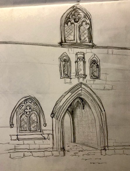
And here is my sketch…I didn’t have time to work out all the problems with perspective. I do not have good visual intuition about perspective so I make many mistakes as I sketch and then have to correct them… guess I need practice! practice! practice!
PS I am having a horrible time working with the new block editor and am sorry for all of the odd formatting. I just don’t seem to be able to get my posts to look the way I want 😦
Time got away from me! I really want to post something at least once a week so stay focused girl!
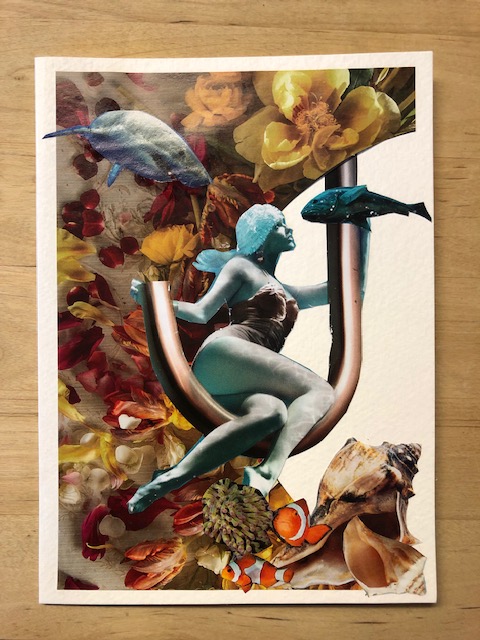
I had a fun day yesterday working on collages. I found a very unusual image in a magazine advertisement for PLUMBING. It was bluish and eerie and I decided to try to make a notecard with it. I combined it with a beautiful floral background cut from a housewares catalog and fish and shells from various magazines. I think the image is provocative and whimsical and unusual.
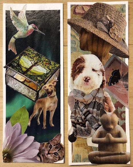
I also created two bookmarks. I am working on a set of bookmarks for the veterinary staff that I visit so frequently. I do love my dogs! These little gifts are proving to be a real treat to give. I dropped off 14 bookmarks for the staff at my local library last week. Talk about dedicated readers! Who could use them more?
I have mentioned several times that I walk most mornings at Ft Benjamin Harrison State Park. It is the site of an old army base and has wonderful wooded areas and is home to ducks, herons, squirrels, deer and beautiful birds. Did I say deer? There are lots and lots and lots of deer! One Sunday morning I saw 6 deer and less than two minutes later 5 deer. The invasive honeysuckle bushes have been cleared and it was very easy to see the deer enjoying their Sunday Brunch.
So why am I telling you this? For many months I have been struggling with the direction I should take with my painting – realistic, representational, or abstract? Animals, still life, abstract or landscape? I have had success with my abstracts and I still love color so I will continue to paint abstracts but they say you will have the most true success (i.e. happiness!) painting what you love. I decided to spend some time painting animals and nature. I always feel peaceful and happy when I’m petting my dogs or walking in the woods laughing at the playful squirrels or listening to birdsong.
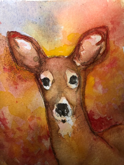
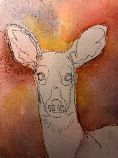
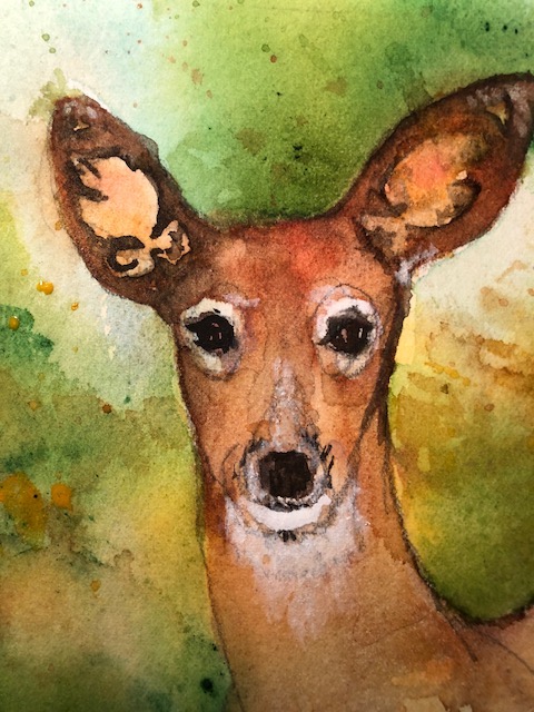
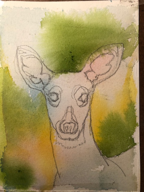
Recently I painted two small watercolors of deer. I started with a loose background over a primary color “mingle” and then painted the deer. I just made up the backgrounds and focused on summer and fall colors.
The deer have slightly different looks and some are definitely enjoying the bounty of the park more than others. It was fun and I just relaxed as I painted. The paintings are a beginning. I hope you enjoy them.
Several times recently I have mentioned the bookmarks that I have been making. I use 140# cold pressed watercolor paper as the base for colorful, whimsical, unique collages. I cut out images from magazines, catalogs, advertising mailings, and just about anything else that has an image I like. I strive to find images that are on paper that is robust enough to hold up as a bookmark. I originally used acrylic matte medium diluted with water as my glue. Now I use clear Elmer’s Glue diluted 50/50 with water.
Created December, 2018
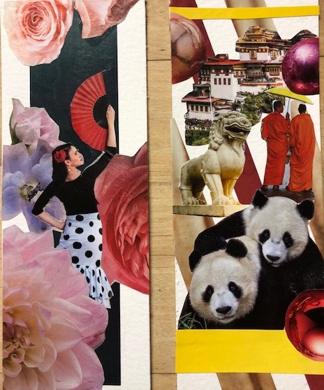
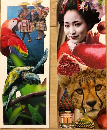
I usually see one object that catches my attention. Then I focus on one word that relates. The word might be a color, a topic (such as Music), or an object (such as Dogs). I spend quite a bit of time assembling and building my composition. Finally I select a background and tweak my composition. I focus on color, overlapping shapes, values, texture and framing. I want to end up with something beautiful, interesting and even funny. Here are some more of my bookmarks. All of these have found a happy home with friends who are readers.
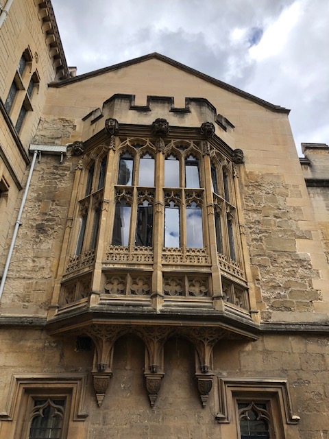
I love to draw. When I left for my trip to Europe this summer I took no art materials because I was traveling alone and was worried about stairways, steps on to buses, anything that would require me to lift or carry heavy bags. And art materials are heavy! However, shortly after I arrived I visited the British Library and bought a pack of 3 small notebooks and 2 pencils. I later bought a larger notebook at the Victoria & Albert Museum. I was off and running and made time to do a few sketches during my travels. While in Oxford I visited Balliol College and sketched their Oriel window.
I loved sitting in this quad surrounded by beautiful blooming plants and wonderful architecture. One thing is for sure. I need a class in architectural drawing – but I loved doing it! For a history of Balliol College click here.
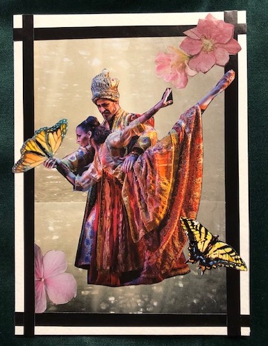
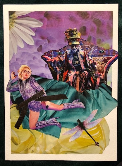
I love working with cutout pieces to make a collage. Right now I am focusing on bookmarks and notecards. Recently I posted a notecard that didn’t quite capture the sense of whimsy I wanted. I added some additional elements and think it is where I want it. My collages are like my art. I have to “live with” them to make sure I am satisfied that they are done.
I also created a second notecard while my thinking about the first was percolating away. Again I have an element of dance in the card and some delicate elements. When I create these collages I look for unusual juxtapositions, happy color compositions and a sense of fun and whimsy. I hope you enjoy seeing both cards!
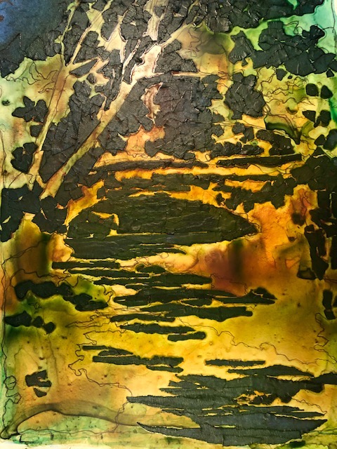
Last fall I took a workshop from a wonderful artist named Sandy Maudlin. She is a painter that uses Yupo as her surface and she typically uses watercolor and acrylic paints in various ways and combinations. Her techniques are what you would call experimental. For her “tape batik” paintings she uses tape to mask her paper as she builds up several layers of color. Her focus is on value (range of light to dark) and she asks her students to start with no more than four values. The color builds up throughout the process and she may finish an acrylic painting with a final layer of watercolor (on Yupo you could not do the opposite!) to achieve the darkest values. The end result has a batik-like appearance.
She starts with a black and white enlargement of the photo you have taken and uses gray scale markers to adjust the image to make a good composition. Then the painting and masking begins…in this image you can see my painting before I applied the darkest values and removed the tape. Looks pretty shocking doesn’t it?
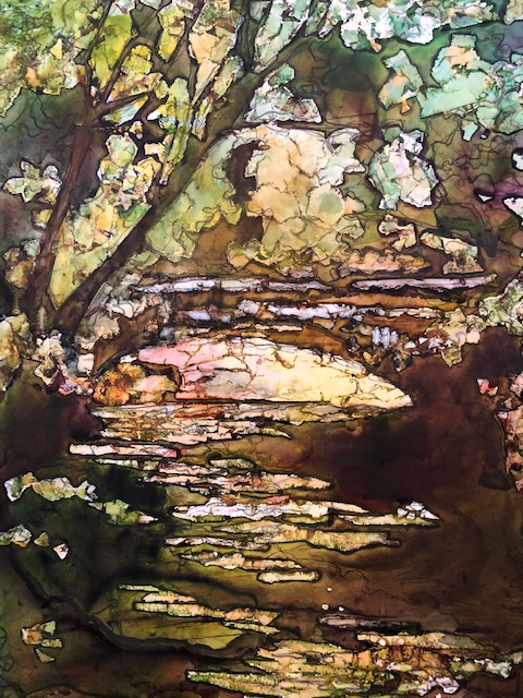
I chose to work with scenes that I had photographed at Fort Benjamin Harrison State Park. A de-commissioned Army base, the park is now a peaceful place and I walk there as often as possible. I painted a bridge that runs over a small creek and was not unhappy with the results. As I get older I am more tolerant with myself and value the learning as much as the result. Here is my final painting: